
Apple updated their Newsroom’s UI 2 weeks ago. I’ve updated the UI of theme Cupertino recently.
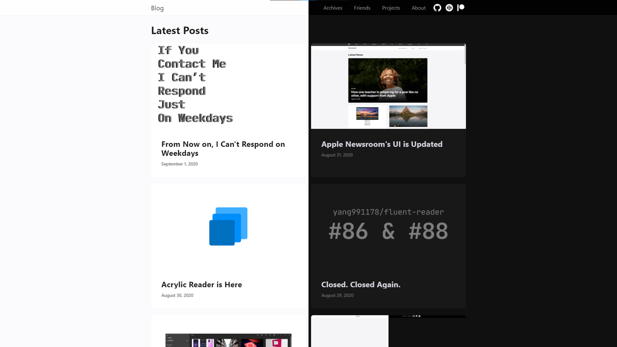
This new UI is still based on Apple Newsroom’s design. It’s post list cards have rounded corners and hover animation just like this:

Theme Cupertino is Updated
This new design is also available in archives page. You can even create one, right in your post in Markdown:1
2
3
4
5
6
7
8
9
10<div class="container">
<div class="card">
<div class="cover-img">
<img src="/img/000015.png" alt="A screen shot of theme Cupertino">
</div>
<div class="content">
<p class="title">Theme Cupertino is Updated</p>
</div>
</div>
</div>
Unlike Apple Newsroom, theme Cupertino also supports dark mode which is not supported by Apple.